You've had quite a difficult time using the Next.js image component at least one time when you're using the framework.
One of the common issues has to do with styling this component. Most of the time, you'll want to add a custom style to the component by passing a className prop to it, but it doesn't work and you'd begin to wonder what exactly you are doing wrong.
In this short guide, we'll go over how you can bypass this issue, and we'll cover some of the props that the Next.js image component can take.
Getting started
There's no doubt that the image component has many awesome quirks that range from image optimization, to UX improvement by adding a placeholder that shows a blurred version of the image when the DOM content is not completely rendered, responsive images, and many more.
The major issue with styling Next.js image component is that it has a default inline styling applied to it.
If you inspect your website or any website that uses this image component, you'll see the inline styles there.
When I inspected the preview images I used on my blog, I found out the exact same thing. Take a look at it below
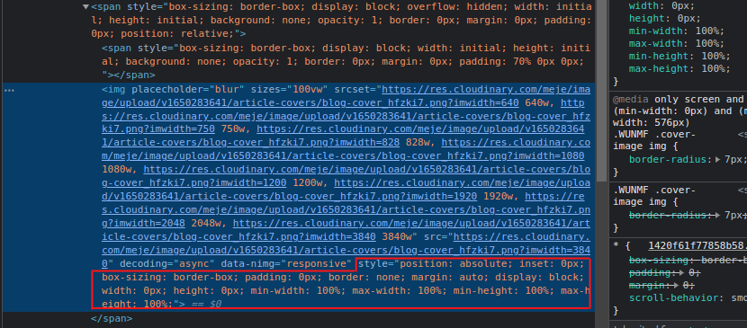
Even when you take a look at the screenshot above, you'd notice that the image component still has some other HTML elements — like the <span> and <div>s nested in it.
Sometimes you might think that applying the !important rule would make your styles reflect in your UI.
Sometimes the !important approach works, and sometimes it doesn't. I've tried using it a couple of times to no avail. I even employed the use of global styles too, but the same issue persisted.
The solution to this styling issue
An optimal approach to solving this problem is to wrap the Next.js image component in a div that you can define a unique className for. Something like the example below.
.img-container {
  width: 120px;
  height: 120px;
  border-radius: 8px;
}
So when you import the image component of Next.js in your project, all you'd need to do is wrap the component in the div that you have created and apply some of the default props of the image component.
See an example below.
import React from 'react'
import Image from 'next/image'

export default function Home() {
  return (
    <React.Fragment>
      <p>image demo</p>
      <div className="img-container">
        <Image
          src="/path/to/images/image-file"
          height={240}
          width={240}
          placeholder="blur"
          blurDataURL
        />
      </div>
    </React.Fragment>
  )
}
The .img-container class still doesn't have access to the image component itself, so you'll need to target the <img /> element in the DOM, this is because the image component of Next.js is rendered as an HTML <img /> element.
Once you've targeted the image element with the .img-container class selector, you can now begin to customize the styles as you wish.
.img-container {
  width: 120px;
  height: 120px;

  img {
    height: 200%;
    width: 100%;
    border-radius: 8px;
  }
}
The syntax above only works when you are using Sass, which allows you to nest your style rules. But you can replicate the same snippet above by looking at the snippet below.
.img-container img {
  height: 200%;
  width: 100%;
  border-radius: 8px;
}
Wrapping up
One of the many principles or patterns behind React is the ability to reuse UI components anywhere and anytime.
Now that you have seen how to apply styles to the Next.js image component, you decide to create a custom reusable component that accepts the default image component as props.
import React from 'react'
import propTypes from 'prop-types'

const ImageContainer = ({ children }) => {
  return <div className="img-container">{children}</div>
}

propTypes.ImageContainer = {
  children: propTypes.node.isRequired,
}

export default ImageContainer
The snippet above shows an ImageContainer component that can be reused anywhere in the codebase.
This approach is to make sure that there is proper validation on the type of data that a component receives in its lifetime. You can read more about the other props that the Next.js image component receives here
That's all for now. If you find this article insightful, I want to say a very big “thank you” to you, for even reading it.