Go back
The grayscale CSS Filter effect
May 14, 2022 · 5 min read
You can do a lot of things with CSS. But a lot of developers complain that it can be quite difficult most of the time, and that, sometimes, is the absolute truth.
This article won’t give you all the knowledge there is of CSS. Hell, it won’t even teach you how to be a guru or a master of this language. If you’re looking for a course or a guide that’ll put you through the fundamentals, you can take a look at Josh W. Comeau’s “CSS for JavaScript developers” course.
So, what then is this article about? Well, the title pretty much gives us a brief info about what we’ll be covering in this guide.
In this article, we’ll be taking a look at the CSS filter() property, and a practical example of how the grayscale() function value can be used in a project.
What is the filter property
The filter() property — when it is declared — adds some graphical augmentations to the elements that are present on a webpage. Most of the time, this property is used on images and for the purposes of altering backgrounds.
The property accepts some function values, and they are:
blur(): this value adds a blurry effect to the image or the element.brightness(): increases the brightness of the imagegrayscale(): this value sets the colors that are present in an image to have a shade of graycontrast(): this value controls the brightness of your images. It seems like it does the same job as thebrightness()function value, but the major difference is that it regulates the dark and light of such images.
You can read more about the filter function values here.
You can take a look at the syntax that represents the usage of the filter property below
img {
  filter: blur(5px) || brightness(20%) || grayscale(90%);
}
Animating the grayscale() function
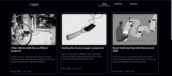
At the beginning of this article, we walked through the CSS filter property. Now, let’s walk through the process of adding a simple transition effect to a card that is like the one you can see on my blog page.
Let’s start by creating the card. The snippet below shows the structure that holds the image and the card texts.
<div className="card-container">
  <div className="cover-image">
    <img src="path/to/image" />
  </div>
  <h1 className="title">Article title</h1>
  <p className="summary">An example article summary</p>
  <p className="date-reading-time">Jan 12, 2022 — 3 min read</p>
</div>
The CSS styles for the card structure above are in the snippet below.
You’ll see that the main wrapper for the card in the snippet above has a .card-container class wrapper which can be used to target the remaining elements in the card wrapper.
.card-container {
  width: 375px;
  height: 488px;
  margin-top: -10px;
  padding: 10px 10px;
  margin-bottom: 44px;
  border: 1px solid #fff;
  margin: 0 20px 20px 0;
  border-radius: 9px;
}
Now that we have the style rules of the card container already available, we can begin to nest the style rules of the other elements in the wrapper, Sass gives us this flexibility.
.card-container {
  /* previous snippets */

  .cover-image {
    height: 300px;
    width: 450px;

    img {
      height: 100%;
      width: 100%;
      border-radius: 7px;
      filter: grayscale(100%);
    }
  }

  .title {
    color: #fff;
    font-size: 18px;
    padding: 12px 0;
  }

  .summary {
    color: grey;
    font-size: 16px;
    padding: 14px 0;
    height: 130px;
  }
}
Setting the height and width of the image element to 100% above, allows it to inherit the size of the .cover-image container, so it retains the specified dimensions of its parent container.
You’ll also notice that we applied the grayscale() function value to the img selector. Next, we’re going to add a transition effect that will animate the grayscale effect of the image when the card is hovered upon.
.card-container {
  :hover {
    cursor: pointer;
    background: #000;
    transition: all ease-in-out 0.3s;

    img {
      filter: grayscale(0%);
      transition: all ease-in 0.3s;
    }
  }
}
Wrapping up
Because we can nest styles in .scss files, we can add multiple transition effects to our elements. As you can see in the snippet above, we have two transition-on-hover effects, one for the card container and the other for the image element.
The GIF below shows a representation of what we've been trying to do. Take a look at it.
I hope this article has helped you understand the concept of filter effects in CSS, and how practically use the grayscale() function value.
Thank you for reading through it, and please, do share it with your peers. Till next time!